
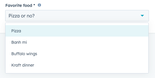
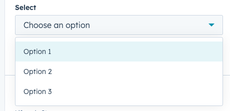
Dropdown
The Dropdown component renders a dropdown menu select field where a user can select a single value. A search bar will be automatically included when there are more than seven options.
You can also make dropdowns show information from 3rd party systems, e.g. pull data from Salesforce or QuickBooks, and show that as dropdown options.
Data Format
The Dropdown accepts data in two formats:
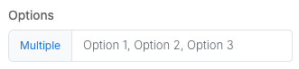
Comma Separated Values
For example, Option 1, Option 2, Option 3.
Array Format
Alternatively, you can pass an array of objects.
[
  { "name": "Option 1", id: "1" },
  { "name": "Option 2", id: "2" },
  { "name": "Option 3", id: "3" }
]
By default, it will use object's name as the dropdown option, and id as value of the selected dropdown.
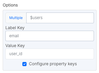
You can customize this enabling "Configure property keys". The Value Key can be set to be empty, meaning the whole object will be used as selected value.
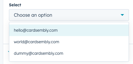
[
  { "email": "[email protected]", "user_id": 123 },
  { "email": "[email protected]", "user_id": 456 },
  { "email": "[email protected]", "user_id": 789 }
]
Was this helpful?